Wednesday, 24 March 2010

Digipak Ideas / Magazine Ideas

These Shots are some stills from the actual music video which i would like to use and incorporate within the digipak and magazine advert.I like this shot because it shows the energy of the band and also it is framed very well giving u a good clear look at the singer and the microphone. However i wont be using this shot within my Digipack because it doesn't on the whole look that impressive and also i think there are several better shots which could be used.
The thing i like most about this shot is how it is framed through the drumkit which allows Otis to be framed centrally. I wont be using this shot however because of the motion blur of the hands and sticks.

This is one of my favourite shots, It has unique composition, style and really reflects what the music video is all about. I especially like how you can see the brick wall in depth bringing your attention right ot the protagonist.

This variation of the previous shot would make a very good magazine advert i think because it doesn't reveal to much about the music video and has a sense of mystery to it which could possibly intrigue the audience and make them want to buy the music video even more.

Although this is a really good action shot i don't think i will be using this within the digipack as it is quite hard to make out who the characters are and exactly what there doing.


I like this shot because it is clear, dynamic and framed very well. I would use this on my digipack to show the opposing forces from the narrative.


Again this one isn't very clear although i do really like the location as it has a very grungey and backstreet feel to it which is the focus location within the music video.

This two shot of mike and danny is quite a fun and energetic shot. However i am dissapoitnted in the motion blur as it could of bee a really good magazine advert.

This shot is one of my favourites because it reflects the raw ideologys of the band. Danny really fits into the part here with his costume and style of playing. The shot its self is very forceful and creates a contrast between the other types of shots which i already have.

I may use this shot within the digipack because of the effective angle which captures the band members in motion. Also it allows room for text in spaces which arnt occupied by important imagery.
The framing within this shot is excellent giving equal space to the character and location. The fact that the face is slightly blurred is very dissapointing as i would of defiantely used this shot for the front cover of the digipack.

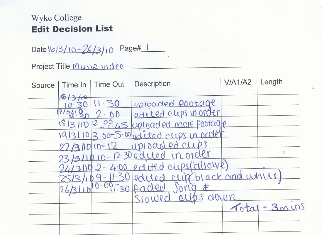
release forms and edit log


These release forms will allow us to use the video how we want for example putting it on youtube or facebook. It is a declaration of the participants approval for it to be seen by others.


This Edit log allowed us to keep track of what we had edited in terms of day to day sessions. It allowed us as a group to see how much work we had done individually and also see how much editing we have to do. One of the major problems with editing was the number of other people who also wanted to use the editing suites. So the vast majority of the text had to be edited in bulk.


Digipak Analysis

Here are some examples of some existing digipak ideas which i have been influenced by.

I chose to analyse this digipak because i think the colour scheme is very powerful and effective. It draws you straight into the design as it is eye catching and bold. The contrasting colours help to add to the genre and ideologies of the digipak as well. There is a lot of information including lyrics and track listings which is essential to navigate around the software.

This Digipak uses some very modern and experimental colour combinations. I feel that this has definitely paid off as it emphasises the ideologies of the artist and his songs. The yellow and pink/purple have an amazing contrast against one an other creating an eye catching effect that no one could resist.
The thing that really draws me into this digipak is the cover art. I especially am amazed at the power such a simple colour scheme and design plan could be so effective. The font its self is nothing special however the imagery surrounding it bring out the best in it emphasising colour tones and mark making techniques. The whole design seems very organic not only with the imagery of the plants and trees but with the bright green colours that bring the piece to life.

This is the template which i have used to achieve the correct resolution for each of my images.

New Genre

In keeping with the rock genre of mad world Beat it takes a slightly more American pop edge giving it a more up-tempo and rhythmic feel. The song itself is about gang’s and fighting which I felt was the perfect opportunity to remake a music video as it already has a great idea behind it. However the pop audience is slightly younger then the soft rock audience as compared to a more adult audience it is aimed at the mainstream music audience, teens. "Beat It" was released on February 14, 1983 as the album's third single. The song was promoted with a short film that featured Michael Jackson and his gang opposing against another gang using dance moves.

Location List

We have used specific locations within the music video to emphasise the conventions of the genre and to create a certain image for the band and the narrative. The Band is filmed in a cluttered garage to give the band and the overall video a real raw and rock n roll vibe. The Garage also fits perfectly with the other scenes as it links in well with the theme of run down and desolate places. The Chase scene was filmed down a back ally along chanterlands avenue. This location sets the mood and gives the audience an idea of the genre of the song. The brick walls and bins really help to add to the overall effect.

Prop List and cast list

Trilbies
Sun glasses
dark Shirt
leather jacket
cigarette

These props are essential for the narrative side of the video as it what the antagonist and protagonist will be wearing. I think that these props are also essential to pull off an authentic film noir look.

Guitar
microphone
bass
drum kit
drum sticks

These props are to create a realistic band set up for the performance side of the video helping the band members to look like a real band and to also make them look like there actually playing.
Daniel Evans - Bassist ... We cast Danny for the part of Bass in the band because he can play to a good enough standard to mimic the song and also because his grungy look fitted into the overall effect of the band. Mike Davies - Vocals/guitar/Criminal ... As it was very hard to find someone to mime the song and still pull off a professional and convincing band attitude very well we auditioned various people to play the part however none of them could pull it off as well as mike. He is a good musician and a convincing actor which was a necessity as he is in both a band performance and acting part. Also his modern image is very up to date and works very well within the convention of our genre and music video. Otis Holmes - Drums ... We cast Otis for Drums as he could play to the standard which was required for the song and also he new the track well before we started rehearsing. Ahmad Majidiasl - Detective ... Ahmad was put into this role because he is a good convincing actor and can keep a very stern face all the way through the sometimes comical scenes of the narrative.

storyboard