In my A2 advanced portfolio my chosen task was to produce a music video which would be part of a promotional package including a digipak and magazine advertisement. As i had many ideas at the very early stages of this project as to what music video genre and narrative i wanted to create i was very hesitant to whether i wanted to join up with a group as i felt they may not appreciate my ideas and also there would be major time keeping set backs if there was conflict within the group. However i decided to involve two members within my group so that we could get much more done in a smaller space of time and to also reflect on each others ideas whilst combining our individual specialised areas in the production process. My first idea was to use the song 'Mad World' by Gary Jules and involve one of our group members as the main protagonist. However after our first shoot following our storyboard i realised that this is not what i wanted to be doing for my music video. This was because i found the song to be depressing and in the end i began to dislike the narrative concept of a depressed young teen. So going back to the drawing board i decided to create something in the style of Film Noir as this was of particular interest to me as i have been studying this genre in Film Studies. The song choice for the new video was 'Beat It' which is one of my favourite songs as it is upbeat, powerful and an all time classic. Taking inspiration from various other Michael Jackson music videos such as ''Billie Jean'' and ''Beat it'' I had an idea of the narrative for the music video and began filming the very same day. The cinematography and directing was left to me as the other members of the group couldn't travel to were i lived which wasn't really a major set back as i felt very comfortable performing these tasks alone. Another advantage of me taking care of this aspect was that i had the perfect location, actors and band to be involved. Michael Davies the main protagonist was great fun to work with as he listened well to instructions and showed great enthusiasm within the filming of the video. The location in which the Band performance sequence was shot was perfect as it reflected the genre and stylistics of the video very well and i was also able to express my cinematography skills learnt throughout the AS and A2 year to there full potential as there was some really good opportunity's for creative and unique angles and shots. When i had completely finished all of the filming I was involved with most of the editing as i felt that the footage i shot was my own and i didn't want anything to ruin it. However i feel that this is very controlling and unfair to the rest of the group as i wanted it all to be perfect and to reflect my ideologies and to produce the film exactly how i wanted it to look. Emma Hirst was very helpful within the group by getting the paperwork such as the edit logs and organizing things like booking in the editing suites. However i feel that if i restarted the project i would definitely work individually because i think that i could of got the same amount of work done on my own. I also think this because in the future i would be happy to be involved in all aspects of the media industry especially the practical side of it such as this as this would of been a great way to express my individual efforts to future employers.
Main Text: Producing the main text was my favourite aspect of the project seeing it come together little by little throughout the creative process.
costume: Keeping within the genre of Film Noir i took inspiration from 'Out of the past' 1947. featuring Kirk Douglas, Robert Mitchum and Jane Greer which takes its audience down a very dark dream of gangster murder and double-dealings. The costumes of the male character within this film are almost identical to that of the protagonist and antagonist within my media text. The Trilbies, cigarettes, Large sun glasses and dark clothing are features of the mise en scene which are all present within film noir and my music video. However in contrast the performance band are in a more modern dress sense as we see Danny in a loose shirt and tie and Mike and Otis in a t-shirt. This dress sense gives off an 'i don't care' punk image which i was trying to achieve and feel i have done.
shots: The lessons in cinematography through analysis of media texts in my media lessons were a huge help in the variety of shots i was able to capture when shooting the film. The Text has a wide range of shots, movements and angles which i thought long and hard about how they would work together when we eventually started editing. Some of my favourite shots in the music video are the closeup shots of the protagonist and antagonist capturing there emotions as they oppose each other. This adds to the intensity of the sequences and helps to break up the action shots giving them more variation and excitement. I especially like the use of many intricate closeups of the protagonist smoking to reflect the genre of the video. One of my favourite shots is the medium upward tilt to reveal the antagonist for the first time. This shot adds suspense and tension as he is slowly revealed. Another aspect of the cinematography that i Really like is the use of long shots to emphasise the length and intimidation factor of the dark back alleys. The only thing i think could be improved in the cinematography is the fact that there is hardly any shots of the whole band together. This is because it was a very small space and was hard to get a frame big enough to capture all three of them and make it look good. However overall i think i did a very good job in capturing the exciting and energetic shots of the performance whilst keeping the shots within the chase scene very orderly and professional.
editing: The editing was really exciting and held a great sense of accomplishment when you see all of the shots coming together. Following the stylistics of Film Noir we decided to put the whole video in black and white to add authenticity and a touch of class. I feel this worked really well. The hardest bit about editing was getting the lip syncing in sync with the actual track. This proved to be very frustrating but we managed to get it looking very effective in the end. I think one of my best skills within the whole of the creative process is how i create the continuity from shot to shot. I feel Ive executed this perfectly as all of the match on action are convincing and all of the shots make sense together.
problematics: The problems i encountered when shooting the main text was that it was very hard to manage all of the costumes every time i had to re shoot as actors would shave, change there hair styles and even lose there clothes. Another problem was getting the material onto the editing suites as there were only a limited number of computers free to work on and most days they were always busy. A problem we encountered as a group was the amount of work that each individual produced varying from each group member as some did more then others which coursed conflict and tension within the group. The last problem was my time keeping skills as i felt i left a lot of the things to last minute and if i started the project again i would definitely get the whole of the creative process going in the very early stages.
how i felt: Overall i felt that the media product was a big success considering the limited number of actors and acting skills they possessed. I felt that the group was a great way of getting things done however i feel that i should of worked individually and created the music video exactly how i wanted it to look.
improvements:The improvements that i would of made to the music video would be to make the stunts bigger and better as the health and safety issues got in the way of making the text more action packed and dangerous. Also i would have improved it by having more willing actors to create a more diverse and exciting narrative.
Ancillary text 1. Digipak
The Digipak was really fun to create although i found in quite challenging in the respect that most of my time was took up by the video making the Digipak a very rushed product. I should of managed my time better as i feel i could of created something much better and more professional. Although i think the Digipak expresses most of the major ideology and genre aspects effectively through the use of imagery, font and layout.
Ancillary text 2. Magazine advertisement
I thoroughly enjoyed creating the magazine advert and because of the previous experience i had in the AS year i found that i knew all of the necessary skills to create a forceful and effective magazine advertisement which appealed to its target audience.
How effective is the combination of your main product and ancillary texts?
I feel that the ancillary texts reflect the genre, image and stylistics of the main music video text amazingly well. This is because not only does it use unique fonts that mirror the raw and grungey look of the band actual images are used from the music video itself to give the audience a sneak preview into the narrative and genre of the text.
In what ways does your media product use, develop or challenge forms and conventions of real media products?
Looking at my music video from a performance aspect it puts in to play many conventions of many music videos especially from the rock genre. The first convention is the lip syncing as on every music video the song which has been recorded in a studio is put over the bands performance. The fast energetic shots give the video a lively and rocky feel creating a more exciting atmosphere for the audience. The music video challenges and develops the narrative from various Michael Jackson videos. The binary opposition of good and evil is mirrored within my music video and Billie jean, which also follows a similar narrative as the detective chases Michael Jackson.
Who would be the audience for your media product?
I feel that my media product would appeal to all sorts of audiences due to the fact that the video combines elements from new age fashion, 80's music and an even older film mise en scene taken from Film Noir. The audience for my media product would be appealing to the younger teen audience as the genre of the track is popular music which they all enjoy and can relate to. Also the idea of a rock bands, rebellious attitude and new age fashion is what appeals to a teenage audience. However the track 'Beat it' is appreciated by audiences of all ages it would be more appealing and memorable to the audiences which experienced it the first time around who would be in the age range of 30 plus. The elements of film Noir would also be very much appreciated and remembered by an audience of elderly people. I think that it is a great achievement to produce a video that can be appreciated by a wide variety of audiences.
How did you use new media technologies in the construction and research, planning and evaluation stages?
In the research stages i used various new media technologies to record my findings and also to find the information i need to give me greater knowledge of the texts i am going to create. The main use of technology for the whole of the project was Blogger. This is a great way to record all of your findings and help keep track of the order of the production process and the best part is you can access it from home as well as college. Also it was very easy to use as i had already used it in AS. Within the construction of the music video i used my own video camera and mini dv tapes. The camera was a Sony handy cam which was perfect because it was easily transported and the Dv Tapes were easy to upload through a fire wire cable onto the editing suites. The editing programme which i used was Adobe Premiere. I found this programme relatively easy to use as i have used programmes with a similar layouts out at home in private projects. To create the ancillary projects were both created in Microsoft publisher as it had all the necessary tools needed to create the layout to how i wanted it to look. Again i had used this programme in AS year so it was fairly easy to use. Photo shop CS3 came in very handy because it allowed me to create some professional effect on my photos. As i also study graphics this programme is familiar to me. 'dafont.com' was a brilliant site to be able to take fonts from because they look professional and you Can get some very unique designs. When creating the Animatic i used windows movie maker to get the slides together and also to get them to the duration i needed. I found the media technology to be very comfortable to use as i had experience in all of them.
I found that trial and error is the best way to improve the quality of your outcomes within a production aspect because it is not up to you to decide how good your texts are it is the target audiences opinion that matters.
Sunday, 11 April 2010

Friday, 26 March 2010
Wednesday, 24 March 2010
Final Magazine advert
This is my magazine advert which promotes the digipak. I kept it simple because i didn't want to reveal too much about the actual narrative and genre of the video, hence the mysterious picture. I thought this would be a good idea because it would make the audience want to know more about the product therefore selling more copies of the digipak. The font in the title ''EMJAY'' was from the website Dafont.com which i have used throughout my studies in media. I found this font to fit in perfect with the ideology of the music video and the band helping to appeal to the target audience. I think that the title attracts you straight away as it has a very powerful and outstanding feel to it. It also helps to emphasise the image of the band as it is very unique and rocky. I decided to keep with the film noir black and white theme because it helped to link all of the media texts that i have created together and also it adds a more mysterious depth to it. The text and date below the title are small and to a minimum as i wanted all of the focus to be on the picture and i also didn't want to give to much away. The image itself is a screen shot from the music video showing the protagonist in a very dark pose emphasising the film noir sinister and deadly theme. The composition of the image displays great perspective as the wall leads you straight up to the image of our protagonist. However i feel that this product was rushed because of the time consuming problematic of the music video. To improve this piece I would of added more information and also included the antagonist.

Final DigiPak
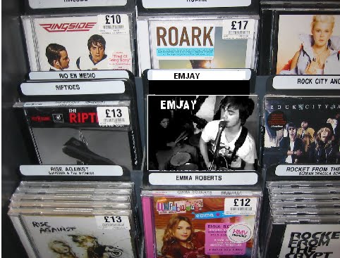 This is how the Digipak would look on sale at a music store. It fits in well with the surrounding CD designs and is also quite subtle not being to overpowering and over the top.
 This is the front cover of the digipak showing a medium high angled two shot of two members of the band. I think that this picture is a great way to engage with its audience directly giving them all the information they need about the digipak. The black and white suggests to the audience that there will be elements of Film Noir which in keeps with the classic original beat it music video. The text is very unique and modern revealing to the audience the grungy and raw ideologies of the band. I think the composition of the piece is very nice as it is very evenly spaced and also the the busy is a nice contrast to the simple yet unique title. I would like to improve this image front cover by adding slightly more information and maybe taking a little more time to research into other existing digipaks.
 The spine is very simple. It sticks to the black and white film noir theme and has all the necessary information which the audience needs. The font is the same to the font features on the magazine advert which shows a clear link between the different media texts. I like how the composition is top heavy making the overall digipak feel different and creative.
The inside cover for the Digipak shows a member of the band playing his bass guitar in a low cantered medium shot. I really like this shot as it provides a nice point to reflect onto the rest of the Digipak creating the right balance between the performance and narrative side of the video. I would have like some more times to alter this picture in Photoshop and give it something a bit more interesting to spice up the digipak.
 This is my favourite part of the digipak as it seems to look the most interesting visually. This is my favourite Photo of the whole of the DigiPak as it gives the audience an insight into the genre and stylistics of the video. Also showing the protagonist as the central image is a great marketing technique as it allows the audience to idolise with him and get a sneak peek at what they can expect from the video and style of music. Another one of my favourite characteristics about this back cover is the font. Its is edgy and raw reflecting the music style and genre of the video. The track list is clearly listed in a bold red font which makes it stand out from the background giving the audience a clear look at the track list.

Digipak Ideas / Magazine Ideas
These Shots are some stills from the actual music video which i would like to use and incorporate within the digipak and magazine advert. I like this shot because it shows the energy of the band and also it is framed very well giving u a good clear look at the singer and the microphone. However i wont be using this shot within my Digipack because it doesn't on the whole look that impressive and also i think there are several better shots which could be used.
 The thing i like most about this shot is how it is framed through the drumkit which allows Otis to be framed centrally. I wont be using this shot however because of the motion blur of the hands and sticks.
 This is one of my favourite shots, It has unique composition, style and really reflects what the music video is all about. I especially like how you can see the brick wall in depth bringing your attention right ot the protagonist.
 This variation of the previous shot would make a very good magazine advert i think because it doesn't reveal to much about the music video and has a sense of mystery to it which could possibly intrigue the audience and make them want to buy the music video even more.
 Although this is a really good action shot i don't think i will be using this within the digipack as it is quite hard to make out who the characters are and exactly what there doing.

 I like this shot because it shows the energy of the band and also it is framed very well giving u a good clear look at the singer and the microphone. However i wont be using this shot within my Digipack because it doesn't on the whole look that impressive and also i think there are several better shots which could be used.
 The thing i like most about this shot is how it is framed through the drumkit which allows Otis to be framed centrally. I wont be using this shot however because of the motion blur of the hands and sticks.
 This is one of my favourite shots, It has unique composition, style and really reflects what the music video is all about. I especially like how you can see the brick wall in depth bringing your attention right ot the protagonist.This variation of the previous shot would make a very good magazine advert i think because it doesn't reveal to much about the music video and has a sense of mystery to it which could possibly intrigue the audience and make them want to buy the music video even more.Although this is a really good action shot i don't think i will be using this within the digipack as it is quite hard to make out who the characters are and exactly what there doing.
I like this shot because it is clear, dynamic and framed very well. I would use this on my digipack to show the opposing forces from the narrative.
 Again this one isn't very clear although i do really like the location as it has a very grungey and backstreet feel to it which is the focus location within the music video.
 This two shot of mike and danny is quite a fun and energetic shot. However i am dissapoitnted in the motion blur as it could of bee a really good magazine advert.
 This shot is one of my favourites because it reflects the raw ideologys of the band. Danny really fits into the part here with his costume and style of playing. The shot its self is very forceful and creates a contrast between the other types of shots which i already have.
 I may use this shot within the digipack because of the effective angle which captures the band members in motion. Also it allows room for text in spaces which arnt occupied by important imagery.
 The framing within this shot is excellent giving equal space to the character and location. The fact that the face is slightly blurred is very dissapointing as i would of defiantely used this shot for the front cover of the digipack.
Again this one isn't very clear although i do really like the location as it has a very grungey and backstreet feel to it which is the focus location within the music video.This two shot of mike and danny is quite a fun and energetic shot. However i am dissapoitnted in the motion blur as it could of bee a really good magazine advert.This shot is one of my favourites because it reflects the raw ideologys of the band. Danny really fits into the part here with his costume and style of playing. The shot its self is very forceful and creates a contrast between the other types of shots which i already have.I may use this shot within the digipack because of the effective angle which captures the band members in motion. Also it allows room for text in spaces which arnt occupied by important imagery.The framing within this shot is excellent giving equal space to the character and location. The fact that the face is slightly blurred is very dissapointing as i would of defiantely used this shot for the front cover of the digipack.release forms and edit log


These release forms will allow us to use the video how we want for example putting it on youtube or facebook. It is a declaration of the participants approval for it to be seen by others.
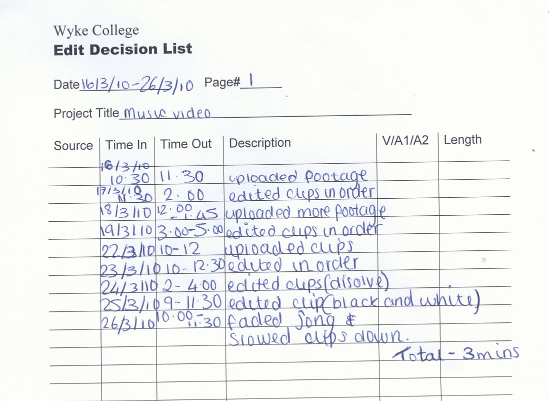
This Edit log allowed us to keep track of what we had edited in terms of day to day sessions. It allowed us as a group to see how much work we had done individually and also see how much editing we have to do. One of the major problems with editing was the number of other people who also wanted to use the editing suites. So the vast majority of the text had to be edited in bulk.
Digipak Analysis
Here are some examples of some existing digipak ideas which i have been influenced by.
I chose to analyse this digipak because i think the colour scheme is very powerful and effective. It draws you straight into the design as it is eye catching and bold. The contrasting colours help to add to the genre and ideologies of the digipak as well. There is a lot of information including lyrics and track listings which is essential to navigate around the software.
 This Digipak uses some very modern and experimental colour combinations. I feel that this has definitely paid off as it emphasises the ideologies of the artist and his songs. The yellow and pink/purple have an amazing contrast against one an other creating an eye catching effect that no one could resist.
 The thing that really draws me into this digipak is the cover art. I especially am amazed at the power such a simple colour scheme and design plan could be so effective. The font its self is nothing special however the imagery surrounding it bring out the best in it emphasising colour tones and mark making techniques. The whole design seems very organic not only with the imagery of the plants and trees but with the bright green colours that bring the piece to life.

This is the template which i have used to achieve the correct resolution for each of my images.

New Genre
In keeping with the rock genre of mad world Beat it takes a slightly more American pop edge giving it a more up-tempo and rhythmic feel. The song itself is about gang’s and fighting which I felt was the perfect opportunity to remake a music video as it already has a great idea behind it. However the pop audience is slightly younger then the soft rock audience as compared to a more adult audience it is aimed at the mainstream music audience, teens. "Beat It" was released on February 14, 1983 as the album's third single. The song was promoted with a short film that featured Michael Jackson and his gang opposing against another gang using dance moves.
Location List
We have used specific locations within the music video to emphasise the conventions of the genre and to create a certain image for the band and the narrative. The Band is filmed in a cluttered garage to give the band and the overall video a real raw and rock n roll vibe. The Garage also fits perfectly with the other scenes as it links in well with the theme of run down and desolate places. The Chase scene was filmed down a back ally along chanterlands avenue. This location sets the mood and gives the audience an idea of the genre of the song. The brick walls and bins really help to add to the overall effect.
Prop List and cast list
Trilbies
Sun glasses
dark Shirt
leather jacket
cigarette
These props are essential for the narrative side of the video as it what the antagonist and protagonist will be wearing. I think that these props are also essential to pull off an authentic film noir look.
Guitar
microphone
bass
drum kit
drum sticks
These props are to create a realistic band set up for the performance side of the video helping the band members to look like a real band and to also make them look like there actually playing.
Daniel Evans - Bassist ... We cast Danny for the part of Bass in the band because he can play to a good enough standard to mimic the song and also because his grungy look fitted into the overall effect of the band. Mike Davies - Vocals/guitar/Criminal ... As it was very hard to find someone to mime the song and still pull off a professional and convincing band attitude very well we auditioned various people to play the part however none of them could pull it off as well as mike. He is a good musician and a convincing actor which was a necessity as he is in both a band performance and acting part. Also his modern image is very up to date and works very well within the convention of our genre and music video. Otis Holmes - Drums ... We cast Otis for Drums as he could play to the standard which was required for the song and also he new the track well before we started rehearsing. Ahmad Majidiasl - Detective ... Ahmad was put into this role because he is a good convincing actor and can keep a very stern face all the way through the sometimes comical scenes of the narrative.


Film Noir
I have decided to take elements from Film Noir and incorporate them within my music video. Film Noir was created by French film critics (first by Nino Frank in 1946) who noticed the fact of how 'dark', downbeat and black the looks and themes were of many American crime and detective films released in France to theatres following the war. The conventions of classic film noir were melancholy, alienation, bleakness, disillusionment, disenchantment, pessimism, ambiguity, moral corruption, evil, guilt, desperation and paranoia. Also the costumes usually were made up of trilbies, sun glasses and dark clothing.I have decided i would like to use all of these elements within my music video to create something which is contemporary yet historic. Also i feel it would give the film a touch of class and would be a great contrast to the rocky song. The theme of black and white would give the narrative a powerful effect and help add to the authenticity of the mise en scene. The characters which featured with Film Noir were corrupt characters and villains which included down-and-out, conflicted hard-boiled detectives or private eyes, cops, gangsters, government agents, a lone wolf, socio-paths or killers, crooks, war veterans, politicians, petty criminals, murderers. I would definitely like to use a detective character within my narrative to portray the antagonist as this would be very helpful in creating a authentic film noir theme.
Song change
Shortly after uploading our original film footage onto the editing suites we realised that there were certain limits into how far we could go involving the sad context and the slow tempo of the song. With the footage that we had we felt that it did not go together with the song and i personally wanted to create something that i really enjoyed doing. We then took a more upbeat approach to the music video choosing the new track, Beat It by Michael Jackson. As i really enjoy playing music and getting together with friends who also play instruments, i took advantage of this opportunity to film a band scene with experienced musicians. Taking elements from various other Michael Jackson films such as the detective chase from Billie Jean we combined these ideas together to create something which was significantly improved and also which i personally feel is very enjoyable to do.
Within the music video 'beat it' there are various aspects within the stylistics which i would like to use in my own project. The cinematography gives the spectator a wide range of diverse shots, movements and angles. I feel that if i do the same within my video it would help to create a more interesting and powerful final product. The editing is fast and static creating the feeling of excitement and adding more action to the sequences. I would like to use fast paced editing in my music video because it would allow me to express my narrative in more depth and also work well mirroring the upbeat song. As the video is set at night time the mise en scene is very dark and grungy which works really well with the song. I would very much like to mirror this effect by also using darkly lit sequences and maybe even using black and white. The narrative of the video is split into to segmants before they become one. It is made up of a performance part as michael Jakson is miming to the words which will be put in sync through the editing later and also a segmant in which there is a narrative unfolding between two gangs. Personally i feel this has a very clever meaning behind it as the creators of the video want to keep the audienced entertained with a story whilst letting them see michael Jackson in action. This gives variation which i would definately take inspiration from for my final outcome.
Beat It lyrics
[1st Verse]
They Told Him Don't You Ever Come Around Here
Don't Wanna See Your Face, You Better Disappear
The Fire's In Their Eyes And Their Words Are Really Clear
So Beat It, Just Beat It
[2nd Verse]
You Better Run, You Better Do What You Can
Don't Wanna See No Blood, Don't Be A Macho Man
You Wanna Be Tough, Better Do What You Can
So Beat It, But You Wanna Be Bad
[Chorus]
Just Beat It, Beat It, Beat It, Beat It
No One Wants To Be Defeated
Showin' How Funky Strong Is Your Fight
It Doesn't Matter Who's Wrong Or Right
Just Beat It, Beat It
Just Beat It, Beat It
Just Beat It, Beat It
Just Beat It, Beat It
[3rd Verse]
They're Out To Get You, Better Leave While You Can
Don't Wanna Be A Boy, You Wanna Be A Man
You Wanna Stay Alive, Better Do What You Can
So Beat It, Just Beat It
[4th Verse]
You Have To Show Them That You're Really Not Scared
You're Playin' With Your Life, This Ain't No Truth Or Dare
They'll Kick You, Then They Beat You,
Then They'll Tell You It's Fair
So Beat It, But You Wanna Be Bad
[Chorus]
Just Beat It, Beat It, Beat It, Beat It
No One Wants To Be Defeated
Showin' How Funky Strong Is Your Fight
It Doesn't Matter Who's Wrong Or Right
[Chorus]
Just Beat It, Beat It, Beat It, Beat It
No One Wants To Be Defeated
Showin' How Funky Strong Is Your Fight
It Doesn't Matter Who's Wrong Or Right
Just Beat It, Beat It, Beat It, Beat It, Beat It
[Chorus]
Beat It, Beat It, Beat It, Beat It
No One Wants To Be Defeated
Showin' How Funky Strong Is Your Fight
It Doesn't Matter Who's Wrong Or Right
[Chorus]
Just Beat It, Beat It, Beat It, Beat It
No One Wants To Be Defeated
Showin' How Funky Strong Is Your Fight
It Doesn't Matter Who's Wrong Or Who's Right
[Chorus]
Just Beat It, Beat It, Beat It, Beat It
No One Wants To Be Defeated
Showin' How Funky Strong Is Your Fight
It Doesn't Matter Who's Wrong Or Right
[Chorus]
Just Beat It, Beat It, Beat It, Beat It
No One Wants To Be Defeated
Showin' How Funky Strong Is Your Fight
It Doesn't Matter Who's Wrong Or Right
Just Beat It, Beat It
Beat It, Beat It, Beat It
These lyrics express feelings of hatred and anger which reflects the narrative i would like to create bringing aspects of power and action within it. These lyrics are about honour and pride ''No One wants to be defeated'' This phrase expresses something i would like to recreate within my narrative possibly having some kind of chase scene involving the protagonist and antagonist going up against each other in a final confrontation. 'Don't You Ever Come Around Here
Don't Wanna See Your Face, You Better Disappear' These lyrics expressing one persons hatred for another telling them to disappear and go away would fit perfectly into the context of a chase scene involving a binary opposition. 'Don't Wanna Be A Boy, You Wanna Be A Man' these lyrics gave me great inspiration for something which I would possibly like to involve within my narrative presenting a face off of to forces trying to prove who is the superior.Within the music video 'beat it' there are various aspects within the stylistics which i would like to use in my own project. The cinematography gives the spectator a wide range of diverse shots, movements and angles. I feel that if i do the same within my video it would help to create a more interesting and powerful final product. The editing is fast and static creating the feeling of excitement and adding more action to the sequences. I would like to use fast paced editing in my music video because it would allow me to express my narrative in more depth and also work well mirroring the upbeat song. As the video is set at night time the mise en scene is very dark and grungy which works really well with the song. I would very much like to mirror this effect by also using darkly lit sequences and maybe even using black and white. The narrative of the video is split into to segmants before they become one. It is made up of a performance part as michael Jakson is miming to the words which will be put in sync through the editing later and also a segmant in which there is a narrative unfolding between two gangs. Personally i feel this has a very clever meaning behind it as the creators of the video want to keep the audienced entertained with a story whilst letting them see michael Jackson in action. This gives variation which i would definately take inspiration from for my final outcome.
Tuesday, 23 March 2010
Original images for Mad World digipack
 This is one of my original digi pack ideas for our first idea. It presents a ghostly image of our protagonist as he looks on into the distance. This would of fit in well with the genre of the music video because it has very sad and mellow tones to the song. The text is very eroded and unique providing a more forceful effect for the Digi packs audience.
Wednesday, 3 February 2010
Due to coursework in other subjects i have found it a difficult task to manage the time i need to successfully complete my outcome for media. However i have come up with a plan which will hopefully allow me to finish the project with time to spare.
Starting from the week back after half term i have divided my teams tasks into a 6 week action plan to help manage our time.
Week 1 : Shoot the whole of the video as we really only need one location based around Wyke college it will be easy to get from one place to another. This is also handy because if we need to re shoot we don't have to go very far.
Week 2 : Upload the footage and analyse it making sure that it is what we wanted and if we need to re shoot anything we can go out and do so.
Week 3: Finish the editing and add any finishing touches we think are necessary to the main text
Week 4: Draw up some ideas for our auxiliary texts and start writing up our music video evaluation
Week 5: Finish our auxiliary texts and music video evaluation
Week 6 : Evaluation of the whole project and make any changes necessary to the blogger and the texts.
Monday, 14 December 2009


Sunday, 6 December 2009
Animatic
This is our original Animatic which outlines the structure of the scenes we are using. However looking back on the detail of the scenes shown within our animatic i think that more closeup shots are needed to be put in to give the music video more variation to make it more interesting and exciting.
Friday, 27 November 2009
Location list
Location list
Wyke college entrance and outside campus. - Protagonist enters through the gates and walks down the path to interact with some piers. The college is perfect for this sequence as it reinforces the verisimilitude of the music video as it is a realistic place for the events to happen. Also our target audience can relate to the situation and surroundings.
Dining room - This location is necessary for the family eating scene to show how the family mistreats the protagonist. The dining room needs to really have the protagonist singled out and centred at the head of the table to symbolise his loneliness.
Quiet street - For this scene various health and safety issues come into play. As we are running somebody over attention could be brought to the fact that spectators might think there has been a real accident. So to avoid getting into trouble with the police we either need to film at a very early time or inform the police and the public in the surrounding area.
Function room - This room dosnt have to be to big as we only really need to use one of the walls to create the effect we are looking for. As we are having a cake with a candle this is a health and safety issue of either getting burnt or causing a fire.
Lecture theatre - We are going to be using the lecture theatre to create .......
Cast List
Robert Hodges – Robert Roswell
Emma Hirst – Car Driver
Nicolle Freitag – In the car
Dan Armitage – Bully
John Hamlin – School teacher
Mike Davis – Paramedic
Emma Hirst – Car Driver
Nicolle Freitag – In the car
Dan Armitage – Bully
John Hamlin – School teacher
Mike Davis – Paramedic
Prop list
Fake blood
Bikes
Cap
Back pack with books in
Table, chairs, cutlery
Dish cloths
Birthday banner
Balloons
Cake with candle
Party hat
Paper
Car
Ambulance jacket
Bikes
Cap
Back pack with books in
Table, chairs, cutlery
Dish cloths
Birthday banner
Balloons
Cake with candle
Party hat
Paper
Car
Ambulance jacket
Subscribe to:
Posts (Atom)